Back in the old days, designing a website is done by hand – which is slow, very inefficient and requires a lot of skill. Of course, you can still make a website applying this process but designing web pages this way is too costly. Other creative solution services are even tempted to make just a few web pages which is not good because websites should have more pages.
Fast forward to 2016. Web sites adopt a new kind of web design optimised for a new breed of web users – the mobile users. Responsive web designs become the hype of building websites in today’s market and with it, new and attractive concepts are emerging that we’re often spoiled as to what trend we should follow.
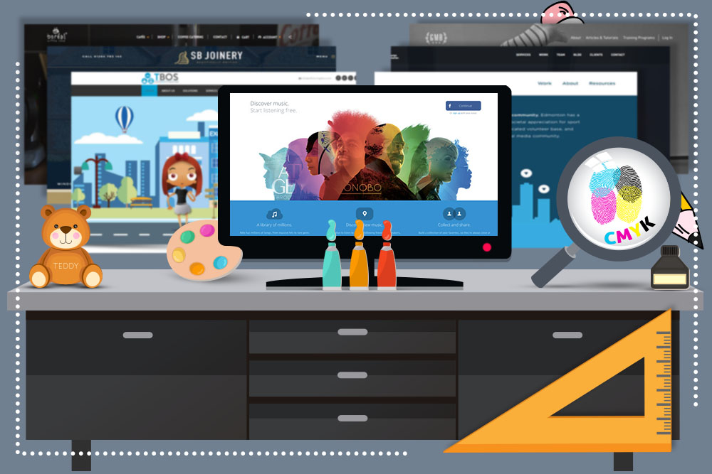
Let’s take a look at some of the web designs that are trending in this year.
Material Design
In its early days, websites are somehow flat, at least in design terms. Come 2014, Google introduced a liberal way of designing websites inspired by the paper-and-ink type of concept called “material design”. Soon, web designs began to look more “materialistic”, or tactile perhaps. Since then, concepts resembling real-world counterparts such as padding, grid layouts, depth, transitions and responsive animations have swept across the whole web.
Sites that use Material design took the design language beyond the norms, but a great place to start knowing the basics is through Google’s humbly floating action button: it animates naturally upon opening a web page or an app. The button also gives an impression that it’s floating above the surface of a page, making it look like real but only better.
Flat Design
Material design’s counterpart, Flat Design, makes it just an inch behind the material design.
With flat design, all skeuomorphic pomposities of material design are rejected in favour of digital aesthetics defined by bright colours, lack of depth or “flatness” and sharp edges. The design proved quite popular amongst minimalist design advocates, as it got rid of the clutter and instead revels toward explicative icons, the separation between screen world and the real world and flat illustrations.
For websites that focus more on content, flat design is a worthwhile choice.
Parallax Scrolling
In 2015, the parallax scrolling trend began its crusade and showed no signs of slowing down ever since. In a parallax scroll design, a website’s foreground moves at differing speeds than the background, making a pseudo-3D effect. Today, its effect has been tweaked by sites to take advantage of multiplane animation and multi-directional scrolling to provide more experience. In some parallax websites, the design attains a certain depth and the foreground pops out, creating a sense of interactivity as they scroll through the website. It certainly came a long way since its first appearance in 1982 in the arcade game Moon Patrol.
Card Layouts
Sites such as Pinterest are totally based on card layouts, with more and more riding the hype including Spotify, Facebook, and Google.
Card layout presents information in the form of stackable cards that can be flipped over to reveal the underside, grouped then spread out and vice versa. This design allows for non-hierarchical organisation loads of information, regardless of what screen or device used.
This added website flexibility has become the key ingredient for every website as screen size standards became obsolete in devices.
Although these trends represent the techniques that you should apply to your website, it’s not necessary for you to be “in” the trend. What really matters is to make sure your website provides the best for your users.